Cakery Website Redesign (School Project)
Caker shop website redesign school project

This is a redesign of a cake shop from my Web Design 1 class. The shop is located in Silverlake, CA, which is a trendy, hip area near downtown Los Angeles. The target audience is young, hip people, young couples, and moms with young kids in the local community. It is meant to have a fun, light, and trendy look and feel.
The goals of the redesign are: to increase sales by showing all of the many dessert options they have, to showcase the style and personality of the shop better than the previous site, to attract younger people and make them want to visit the shop after they see the website, and to get more event bookings.
Below is the final logo and homepage design element. The logo was made using inspiration from cake boxes and cupcakes.

Below are all the colors used throughout the design.


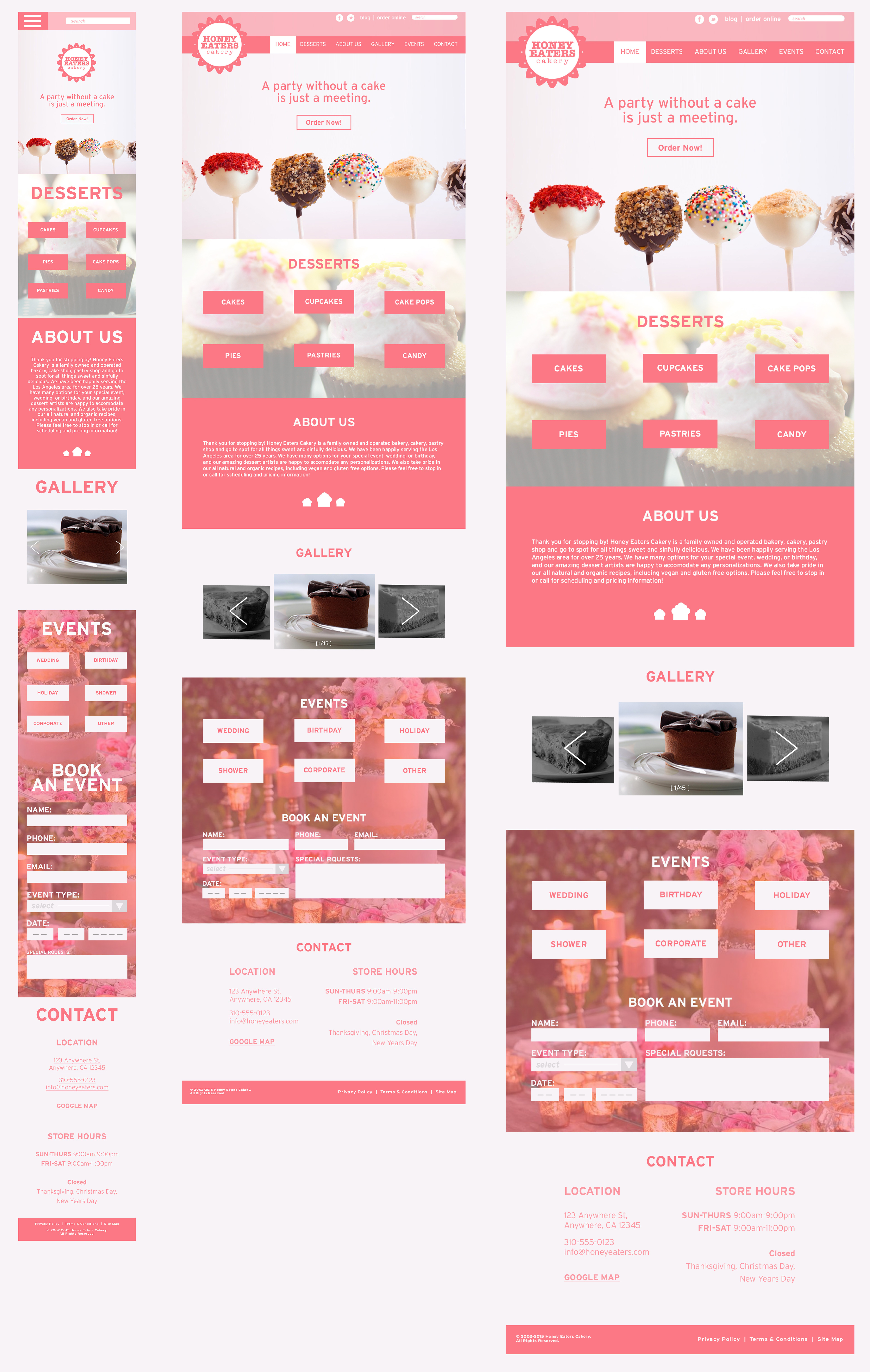
Below are the mobile, tablet, and desktop final compositions.

This is the final comp of the desktop version of the site. The site will contain all of the information on a single page. The navigation links will link to anchors in each section. Each section may have links that either pop out, or open in a new window. I felt this was a better decision for this type of site because of the amount of content on the site.

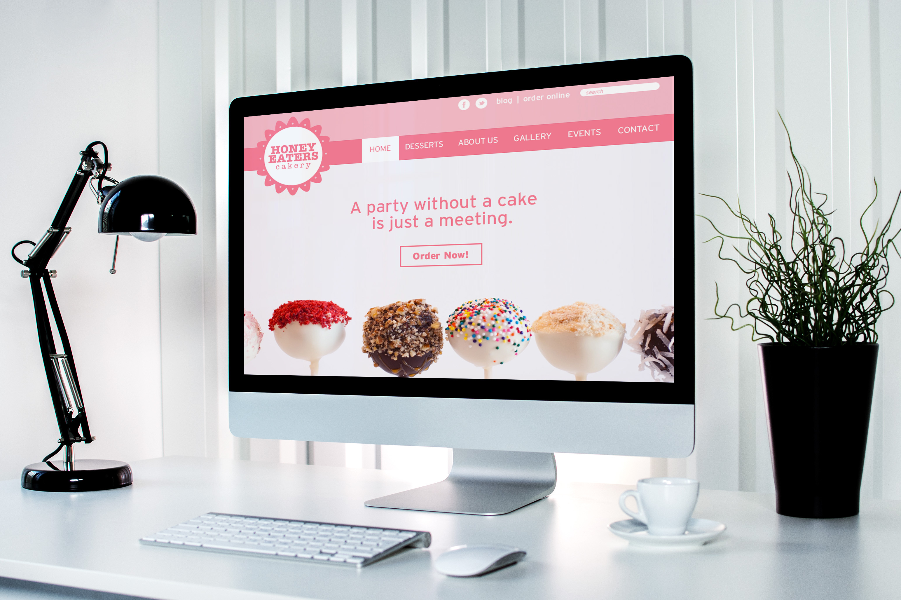
Below is a mockup of what the site will look like when it is live. I wanted to make sure that everything above the fold is eye-catching, colorful, and would inspire the user to want to look deeper into the site and buy some delicious desserts.
